Designing a better loan experience to drive growth for small businesses and lenders
As the founding designer, I helped shape end-to-end design for a startup simplifying business funding. Working with leadership and engineering, I turned complex processes into simple, trusted experiences that drove product-led growth, brought in 30,000+ users, and strengthened business performance and credibility.
Company
Role
Headquarters
Timeline
The project
Securing funding is a critical moment for small business owners, but the process is often confusing, time-consuming, and full of financial jargon. They were left feeling lost, while lenders faced incomplete or mismatched applications, leading to missed opportunities.
Levr.ai aimed to be the platform that removed this friction: helping businesses discover the right lenders, understand their options in plain language, and apply to multiple sources through a single, streamlined application. And in turn, help lenders receive complete applications.
Key achievements
As the founding designer, I worked on all aspects of design for a true zero-to-one build of Levr.ai, shaping product strategy, driving user research, and designing core experiences from scratch. I partnered closely with leadership, developers, and marketing to launch and continuously evolve the platform and internal processes.
1. Product roadmap
2. End-to-end product
3. Scalable design process
The result
$14 Million
30,000+
“We now work exclusively through Levr.ai”
1. Product roadmap
Laying the groundwork: Research & Discovery
Understanding the audience’s pain points
With a shoestring budget and very little time, I managed to conduct a competitor analysis and a handful of interviews with small businesses and private lenders. I uncovered the critical pain points on both sides of the lending process. This allowed me to identify key opportunities to streamline the experience for both parties. You can read more on how I do this in my article How I uncover customer insights that actually shape the product.
Key Insights from business owners, brokers and lenders
😩 Business owners were:
😤 Brokers and lenders were:
Frustrated with incomplete and unqualified applications that wasted their time and potentially led to revenue loss.
I’d been with them [their bank] for 20 years. I couldn’t believe they said no to giving me a loan. A complete kick in the teeth.
Small business owner
I have no clue what I can qualify for. I go on Google and there’s so much info and ads, it’s overwhelming. I give up before I even start.
A clear path forward: Determining the roadmap
Committed to a user-centered design philosophy I established a user journey that would guide the business owner through the process of exploring their options and confidently applying to lenders.
This led to three core features:
1. Onboarding & questionnaire: Simplifying the starting point.
2. Loan matchmaking: Connecting businesses to the right lenders, faster.
3. Unified application: One streamlined submission to reduce friction.
I brought these insights to leadership, and together we mapped a product direction that balanced user needs with investor expectations.
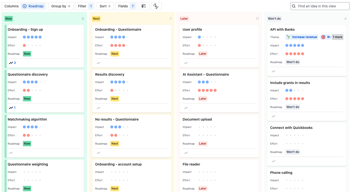
High-level recreation of our roadmap when kicking-off the project
2. End-to-end product
Establishing trust: Onboarding and questionnaire
Onboarding and the questionnaire were the first touchpoint of our product for businesses, so it needed to be simple, clear, and build trust instantly.
Ideation and wireframing
Challenge: The starting point
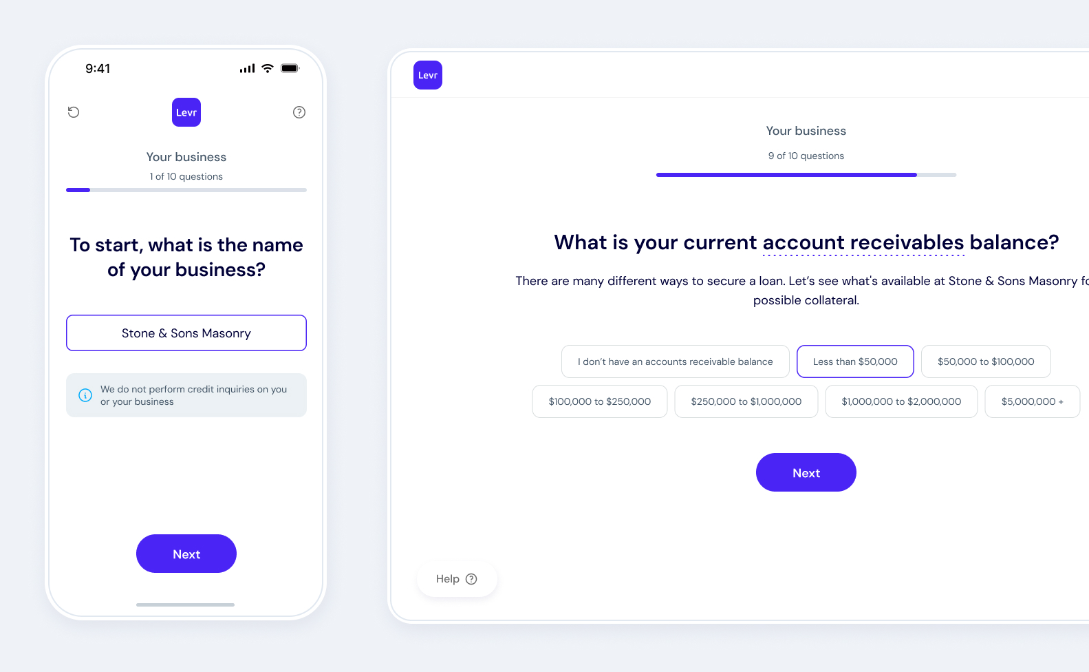
Levr.ai had an early sign-up and questionnaire, a dense 2-step modal with ~20 mixed-format questions. It overwhelmed users on mobile and led to poor completion rates.
Goal: Reduce friction
Drawing from popular survey tools, I reimagined the flow as a guided, one-question-per-screen experience to reduce cognitive load and make onboarding feel effortless across devices.
Goal: Build confidence
To increase trust and engagement, I incorporated clear expectations, security signals, and small moments of positive reinforcement to keep users motivated through the process.
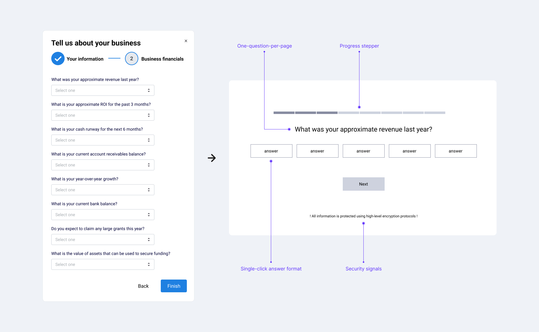
Upgrading the questionnaire format to reduce cognitive load and improve conversion
The result: 300% increase in conversion
The redesigned onboarding balanced data collection with user comfort. A step-by-step flow, clear progress indicators, and trust signals made the process simple and approachable, with gamification elements that encouraged users without feeling patronizing.
Immediate impact
✅ Completion rates jumped from ~30% to over 90%
✅ Time to complete dropped from ~16 minutes to just 2.5 minutes
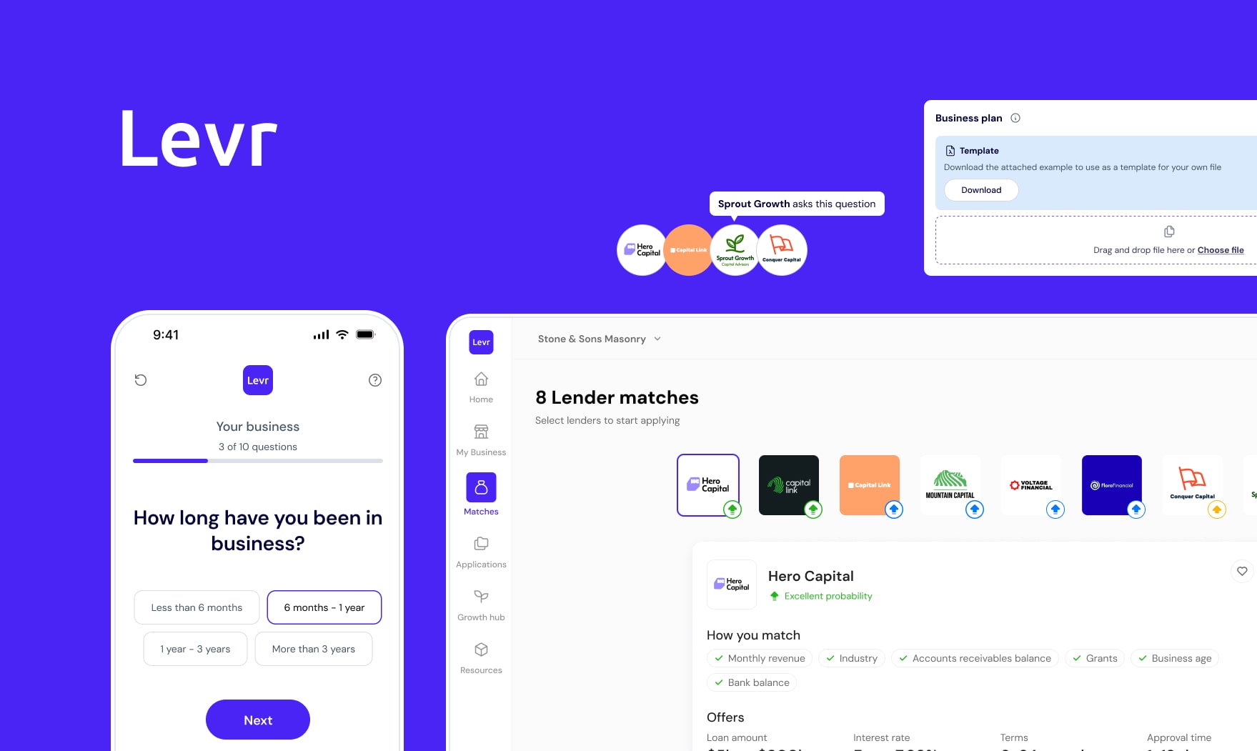
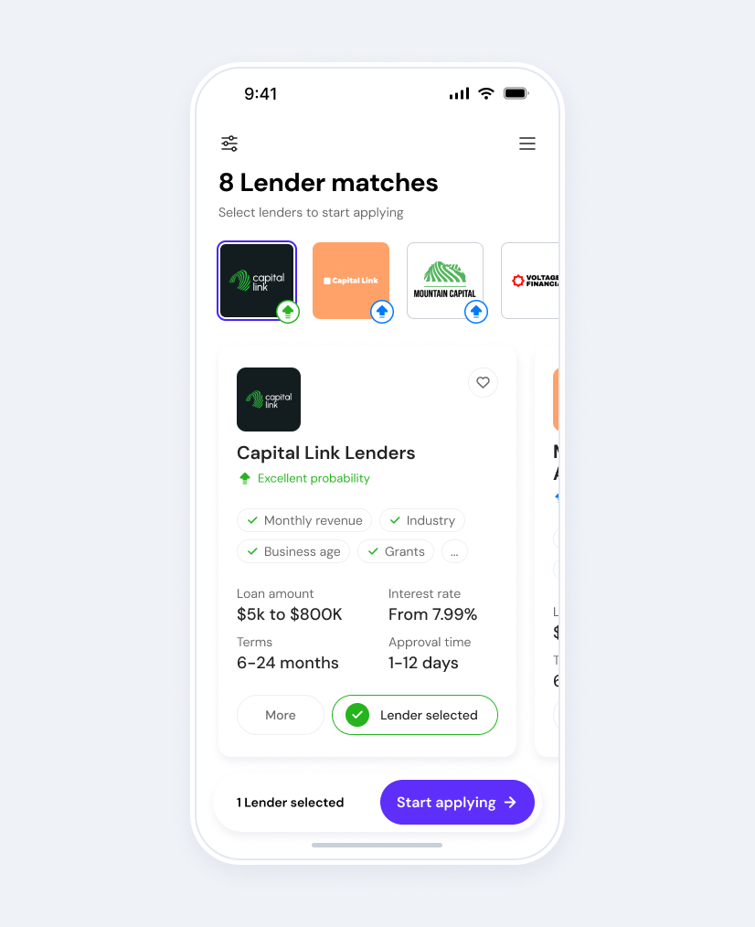
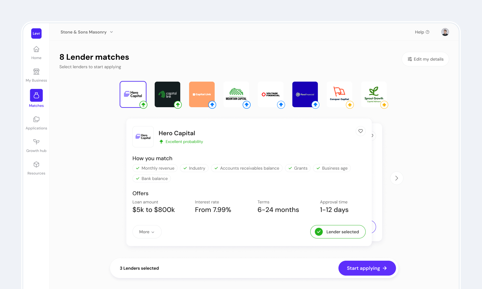
Building confidence: Loan matchmaking
Design challenges and ideation
Challenge: How to best display matches
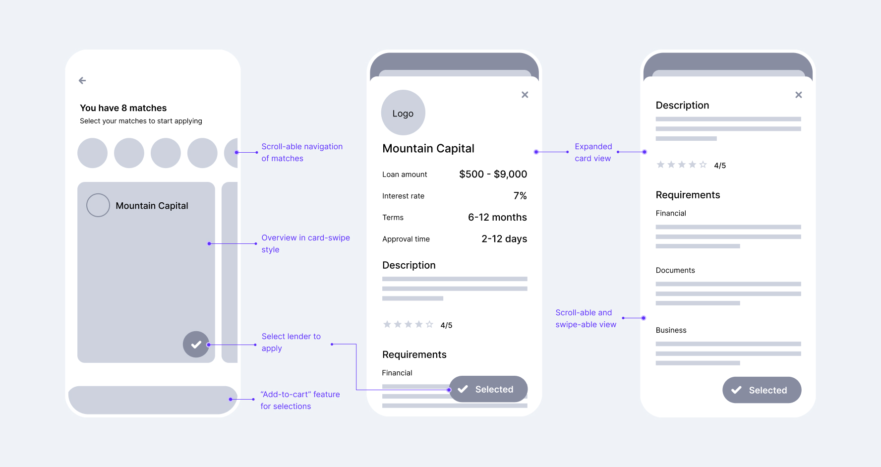
One of the first ideas was a card-style interaction inspired by dating apps; familiar, lightweight, and easy to navigate. I explored how swiping could simplify a complex process and make it feel more approachable.
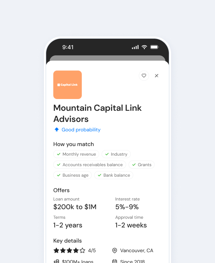
Goal: Support better decisions
Testing and validation
Identifying the key selling points
Quick user tests showed the most critical data points were: approval odds, loan amount, interest rate, and term length. Users wanted immediate clarity without complexity. Their visual weight and positioning were revisited to have a greater focus.
Further reinforcements required
Testing revealed that clear, confidence-boosting signals were essential. A probability of approval scale was ideated to give users an immediate sense of where they stood, without overwhelming numbers or jargon.
Users also wanted more transparency around why they were matched. To support this, I designed a criteria checklist on each match card, linking their own answers to lender requirements. This reinforced trust in the platform and gave users clarity in their decision-making.
Out of scope, for now...
The result
We found the final design delivered the right information at the right time. Familiar interaction patterns reduced friction, while clear visual hierarchy empowered users to make confident decisions.
Overwhelm turned to confidence
✅ Most positively mentioned feature in further testing and surveys
✅ Users reported “feeling in control” of the loan process
✅ Increase in users moving from viewing matches to starting applications
Final design for loan matchmaking results
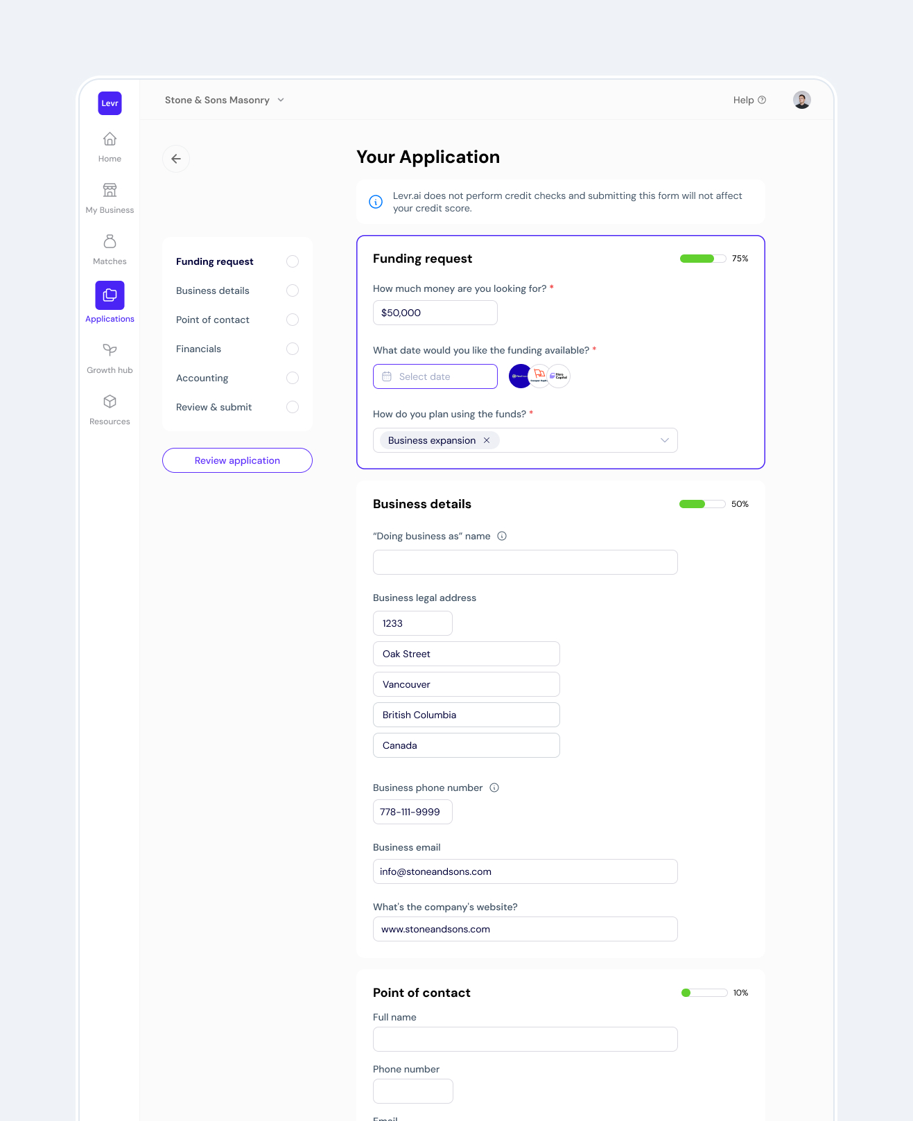
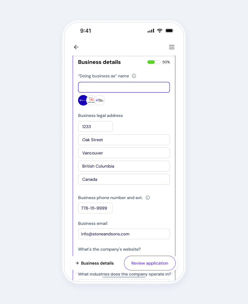
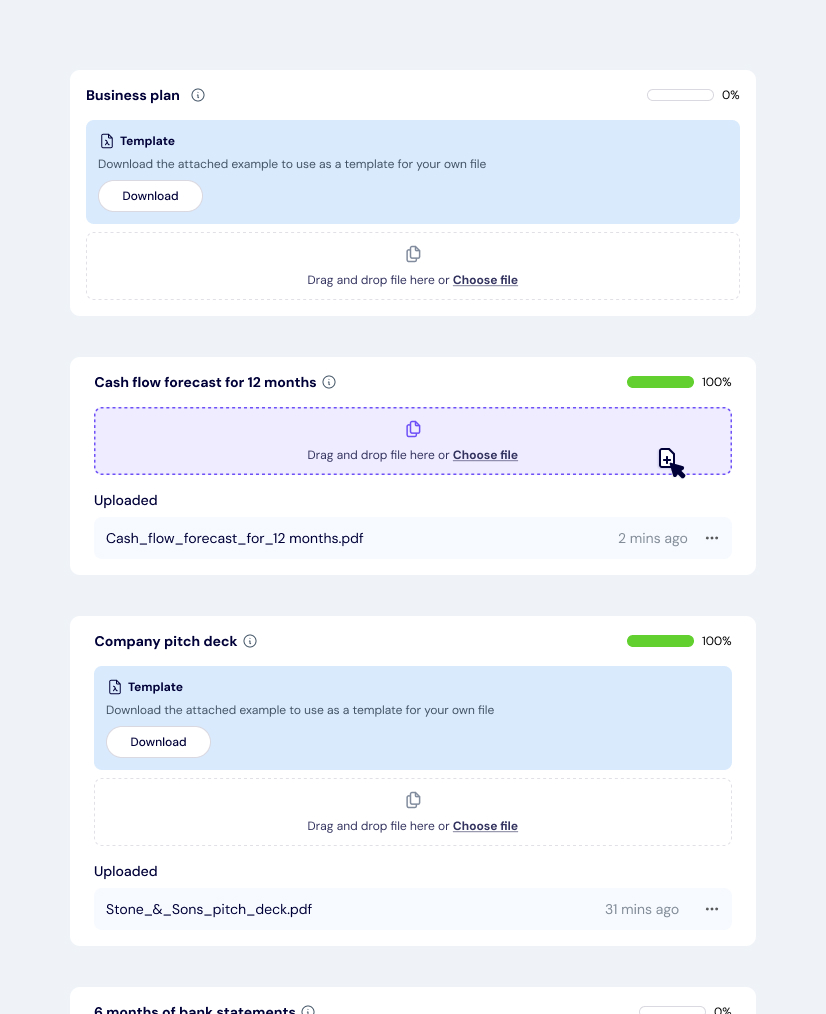
Reducing friction: One application, multiple lenders
Design challenges and iteration
Challenge: Time constraints
Challenge: Invasive questions
Challenge: Uncommon pattern
Early testing showed users didn’t realize they were completing one application for multiple lenders. To fix this, I added a visual indicator linking their progress to individual lender applications, making the process clear and intuitive.
The result
The redesigned application flow delivered results. By reducing friction and confusion, we saw a clear increase in completed applications and multi-lender submissions, meaning more small businesses secured loan offers, faster.
The streamlined experience also drove referral revenue, as more businesses applied through our platform. Lenders benefited too, with fewer incomplete applications and less back-and-forth, strengthening both partnerships and platform credibility.
The process became not just simpler, but more effective for the business owner, the lender, and for us.
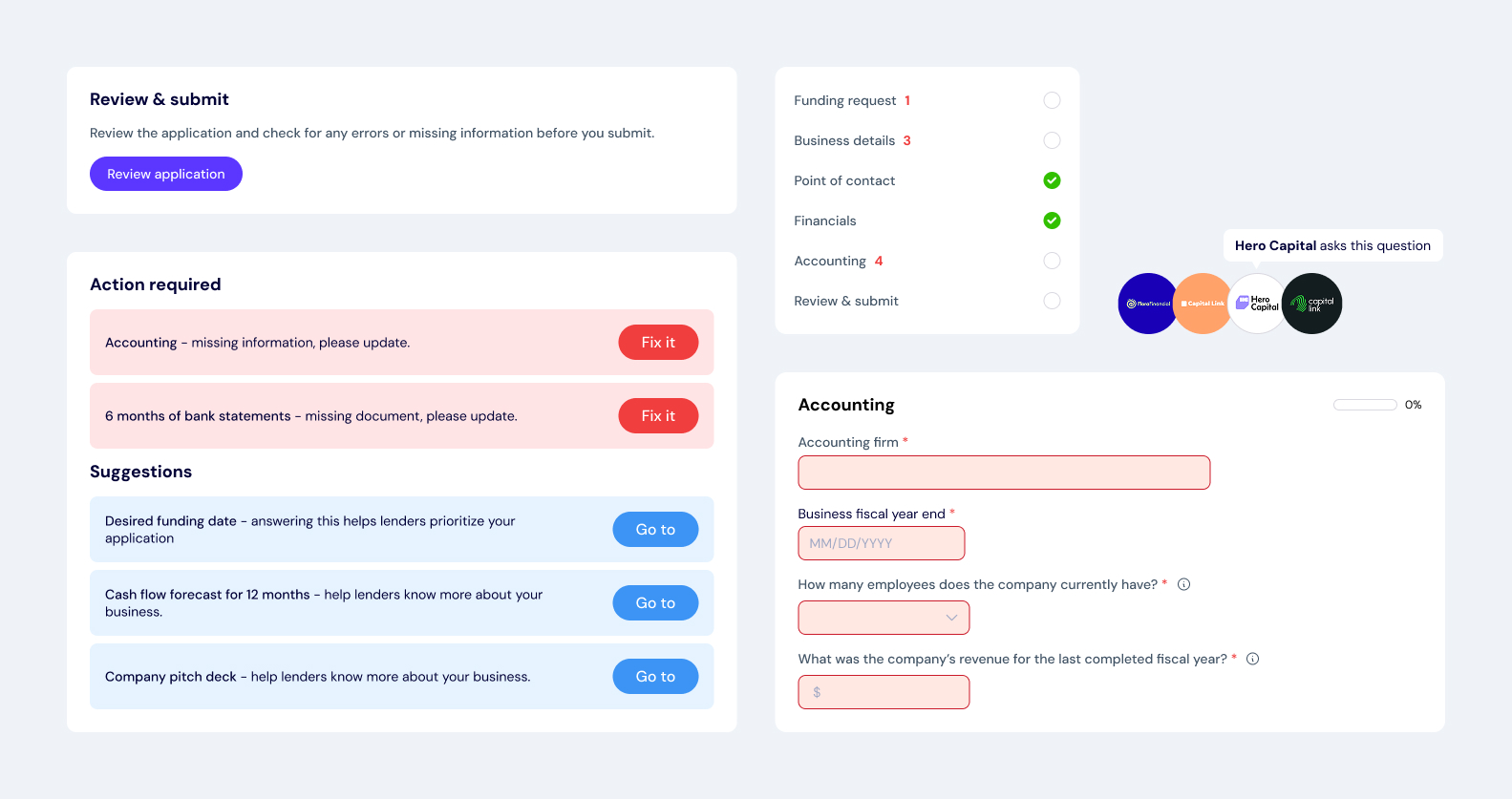
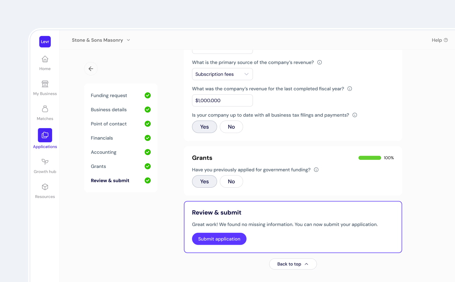
Final design for the application step
3. Scalable design process
Cross-Functional handoff and review process
Collaborating for clarity and speed
Bringing checklists into Jira
Changelog-style design updates
Developers as users
Retrospective
Designing a zero-to-one fintech product taught me what building from scratch really means, shaping not just the UX, but the design process, team rituals, and product vision. I had to move fast, make clear decisions, and adapt within tight constraints.
The biggest impact came from collaboration. Working closely with developers and co-founders, I learned that great design is as much about alignment and iteration as it is about the user’s experience. I refined hand-off and communication to support engineering workflows, speeding up delivery and reducing friction.
Above all, I learned to stay focused on what matters: solutions that solve real user problems, drive growth, and scale with the business.

Jennifer Daly
“Rhi’s super-power was definitely her exceptional ability to balance UX/UI priorities in tandem with the evolving needs of the product roadmap. She has an incredible understanding of the customer and used that insight to develop user-centric designs that make Levr.ai beautiful software to use. Her ability to recognize customer needs and translate it into products allows the team to learn and quickly optimize.”
Related articles