Streamlining broker workflows with purpose-built SaaS
Company
Role
Headquarters
Timeline
2 years
CEO, CTO, 2 designers, 1 marketer, 4 developers
User research
Process development
The project
The platform originated from the success of a prior product designed for small business owners seeking loans. That product guided users through the lending process and produced unusually complete and high-quality loan applications. This caught the attention of lenders, who began asking how we generated such thorough submissions.
Their feedback revealed a bigger opportunity: brokers who facilitated loans between small businesses and lenders were struggling with fractured processes, poor document handling, and time-consuming admin work. No dedicated platform existed for them. They were forced to bend CRMs, spreadsheets, and email workflows to fit their needs.
This was a clear opportunity to create an in-demand and purpose-built solution.
Key achievements
My strong advocacy for ongoing user research became a driving force for both product growth and product direction. Partnering closely with another senior designer, I turned insights from user interviews into a platform that not only solved daily challenges but also sparked product-led growth by empowering brokers to seamlessly bring small businesses and lenders into the ecosystem.
1. Research & iteration
2. Direction & strategy
3. Scalable design system
The result
The platform quickly gained traction, with 30+ companies adopting it in the first year via product-led growth. It reduced funding timelines to as little as two hours and saved one client “over 500 hours of work annually”.
Company valuation
$14 Million
Clients
30+ companies
Increased 25 x
1. Discovery, research & iteration
From the beginning, our focus was on deeply understanding the needs of our broker users. I worked closely with the other senior product designer to organise and conduct dozens of 1:1 interviews with brokers who were already engaged with our previous product. We approached these conversations as open-ended and observational: mapping their workflows, asking about their biggest frustrations, and understanding which parts of their day were lost to admin overhead or repetitive tasks.
Uncovering pains with user research
Many of the insights we gathered fundamentally shaped the product’s direction:
- Brokers spent an inordinate amount of time chasing documents and clarifying requirements.
- Communication was fragmented; happening via email, phone, SMS, and even spreadsheets.
- Existing tools weren’t built for their use case, so they were constantly patching together workflows from multiple systems.
Distilling insights into actionables
Through this feedback, we helped guide our conversations to prioritise the reduction of repetitive manual tasks. We were strong advocates for building workflows that mirrored brokers’ existing habits, not asking them to change how they work, but instead giving them a platform that naturally fit into their already established processes.
This wasn’t a one-and-done phase. We continued to meet with brokers throughout the build, showing them early concepts, gathering qualitative feedback, and incorporating changes based on usability insights. After launch, we kept open channels with our first clients, conducting follow-up interviews and watching how the product held up in real-world scenarios.
The company was under immense pressure to move quickly. We had active venture capital backing, and our investors were pushing for fast adoption and traction. This meant we had to constantly balance user needs with growth expectations. It wasn’t enough to just build a great experience, we had to be strategic in how we delivered business value through user experience.
2. Product direction & strategy
As a team we had to be strategic in what we wanted the product to be and what we didnt want it to be.
Brokers asked for a wide range of features, from fee calculators and call logs to advanced CRM functionality. We had to prioritise what would deliver the highest value early on, for our users, and our VCs.
Defining our value prop
Our north star was reducing the amount of manual and repetitive tasks brokers were performing and to reduce the time between application submission and funding.
We focused on providing the following benefits with our platform:
- Centralised client intake and application management
- Improved document submission quality and follow-up
- Simplified communication between brokers and clients
- Broaden their lender network
Another strategic decision we championed was aiming for product-led growth. Instead of relying solely on sales, we designed the experience to encourage organic adoption:
- Brokers could invite small businesses directly via custom URLs
- Lenders and brokers could easily collaborate on deals, inside the platform
MVP challenges & solutions
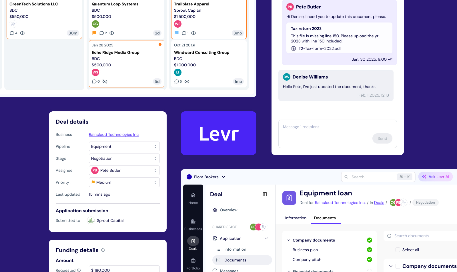
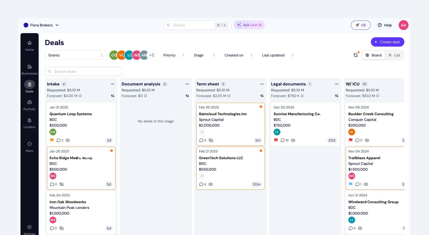
1. Centralised application management
Initial challenge: Brokers were manually transcribing email submissions into makeshift systems. This was a significant chunk of their admin work and most had no dedicated filing structure.
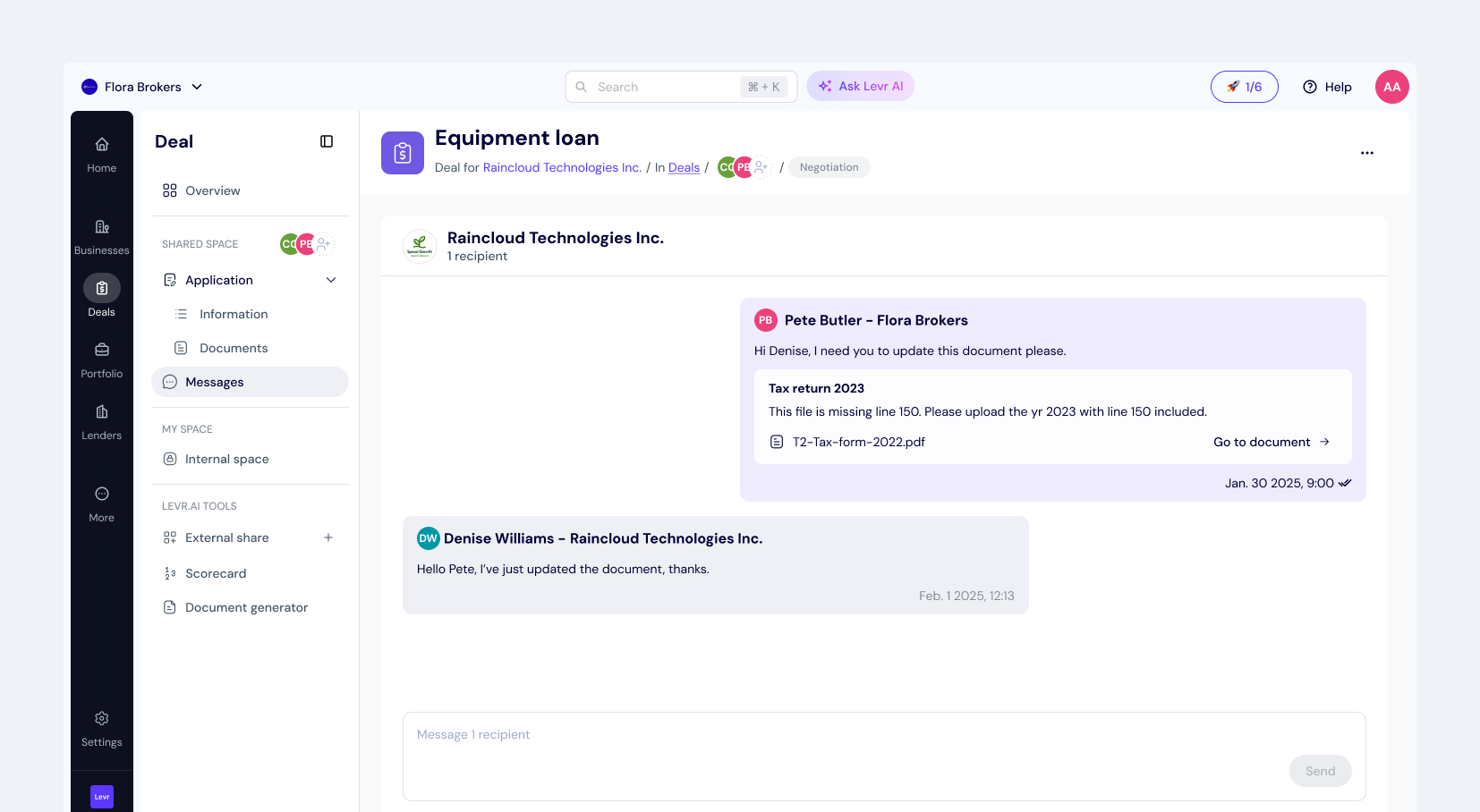
MVP: We created dedicated URLs where clients could apply directly to a broker. Submissions automatically populated a CMS-like dashboard with a profile for the client and an associated application with the profile.
Problem: As brokers began to use this system and create profiles on behalf of their clients, they found our many applications to one profile architecture too strict. Also, due to technical constraints, brokers had to pre-select the intended lender before starting an application for their client. Despite user interviews revealing that most brokers know who an application is intended for (the lender) prior to starting it, real-world use of the platform revealed that was not always true.
Solution: We created data sharing between client profiles and their applications, allowing brokers to freely transfer data collected on their clients between the different features in the platform. This reduced the brokers concerns over the ‘strictness’ of the platform. We also worked towards helping brokers start applications without pre-selecting a lender by making the step optional.
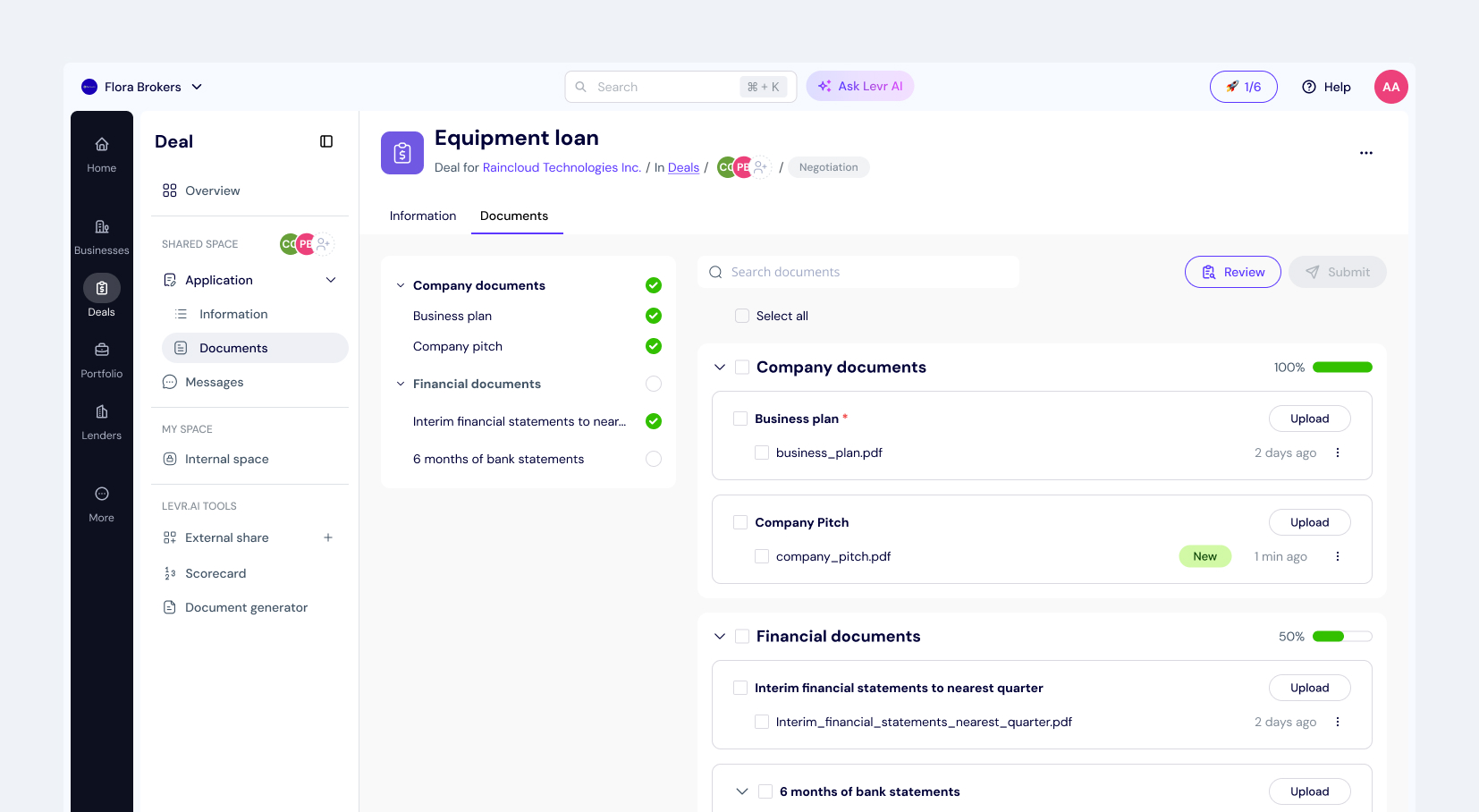
2. Smarter document collection
Initial challenge: Brokers were receiving poor-quality or missing documents.
Solution: We built a guided uploader for clients with examples, templates, and clear instructions. Brokers could flag incorrect documents with a note, and clients received structured feedback within the platform.
3. Clear steps and process
Problem: Small business owners were in the dark on what to do next. Brokers needed to constantly check-in with their clients
MVP: We introduced an automatically updated stepper that showed application status for the client. The stepper was updated by the broker moving the application through their own pipeline.
Problem: After launch brokers expressed a need to control what clients saw as they felt a duty of care and protection from bad news. If a broker were to move an application into “Rejected” in their platform, then they would not want their client to be notified automatically.
Solution: We made auto-updates optional with a settings page. Additionally, if a broker were to move an application into “Rejected” we would ask if they wanted to communicate this with their client.
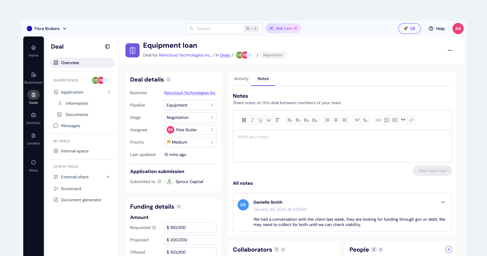
Consolidated messaging
Problem: Communication was scattered across multiple email threads.
MVP: We built in-platform chat styled after familiar tools like WhatsApp. Messages triggered email notifications and 3-day response reminders. This reduced follow-up fatigue for brokers.
Testing & Iteration
Our MVP wasn’t the end of the story. In fact, it was just the beginning. Together, the other product designer and myself led post-launch research efforts to ensure the product was holding up to expectations and delivering real value in the field.
We conducted:
- Regular follow-up interviews with early adopters
- Observational sessions using screen recordings and video calls
- In-app feedback tools for fast feedback and bug collection
We worked directly with leadership to refine our product prioritize changes in agile sprints. We also championed continuous feedback loops, ensuring that research wasn’t just a phase, but a core pillar of our ongoing design process.
A personal win was seeing our advocacy for user research turn our staunchly back-end-focused CTO into the first point of call and champion for any customer feedback or user research sessions.
3. Creating a scalable design system
Engineering collaboration and hands-on implementation
Tools and implementation
Continuous evolution

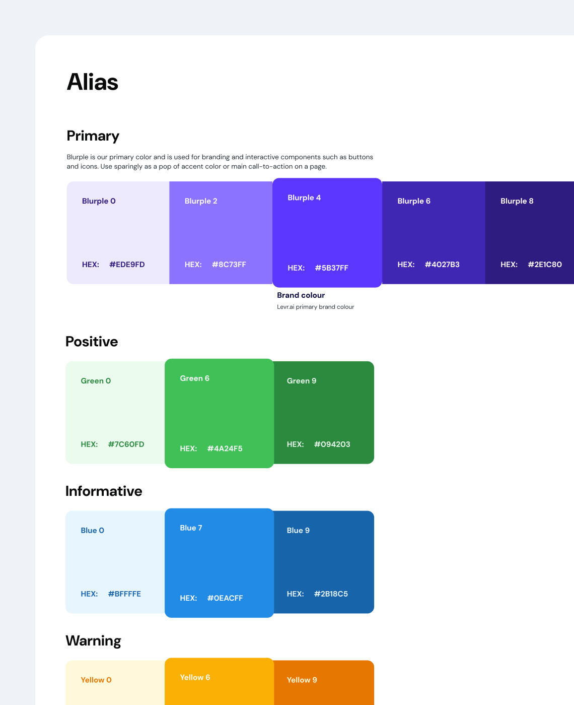
Snippets of design system created in Figma
Retrospective
This project demanded a mix of user obsession, business strategy, and rapid iteration. As one of two senior designers, I played a key role not only in execution, but in shaping the direction of the product itself. We balanced the very real pressure to grow from our VCs with a firm commitment to solving real user pain points.
I’m proud of:
- Driving continuous, relationship-based research across two years
- Grounding product decisions in qualitative insight
- Advocating for user control, clarity, and automation at the right moments
- Creating workflows that respected how brokers already worked, rather than forcing behaviour change
If I were to do it again, I would advocate for fixing critical technical foundations before attempting to design around them. In one instance, we knew, based on user feedback, the exact experience brokers needed, but delivering it would have required significant engineering work to re-architect a part of the back-end. Instead, we invested time in multiple design iterations that could only partially improve the experience, and a confusing step in the process remained. With the right technical groundwork in place earlier, we could have addressed the issue directly instead of going in circles trying to work around it.

Kaylan Pepin, CPA, CMA
CEO @ Levr.ai
“From day one, Rhiannon brought clarity to complex workflows, a strong user-first mindset, and a calm, collaborative presence that made her an anchor across product and engineering.
She led the end-to-end design of our core platform, transforming early wireframes into an intuitive experience for lenders, brokers, and business owners. Whether it was tackling legacy UI debt, designing for scale, or navigating technical constraints, Rhiannon consistently brought sharp thinking and thoughtful execution to every challenge.”
Related articles

What I learned as the first product designer in a SaaS startup
Rhiannon Mapson • 4 min read